Kay Designs
Hi, I’m Kingsley, a graphic designer passionate about branding and visual storytelling. I love creating bold, meaningful designs that help businesses stand out, whether it’s a logo, social media content, or marketing material.
With experience in freelance design and social media management, I combine creativity with strategy to make an impact. My go-to tools? Adobe Illustrator, Photoshop, and Canva.


Branding
Here’s where ideas turn into full brand vibes. From logos to layouts, I love helping brands build a visual identity that feels like them.
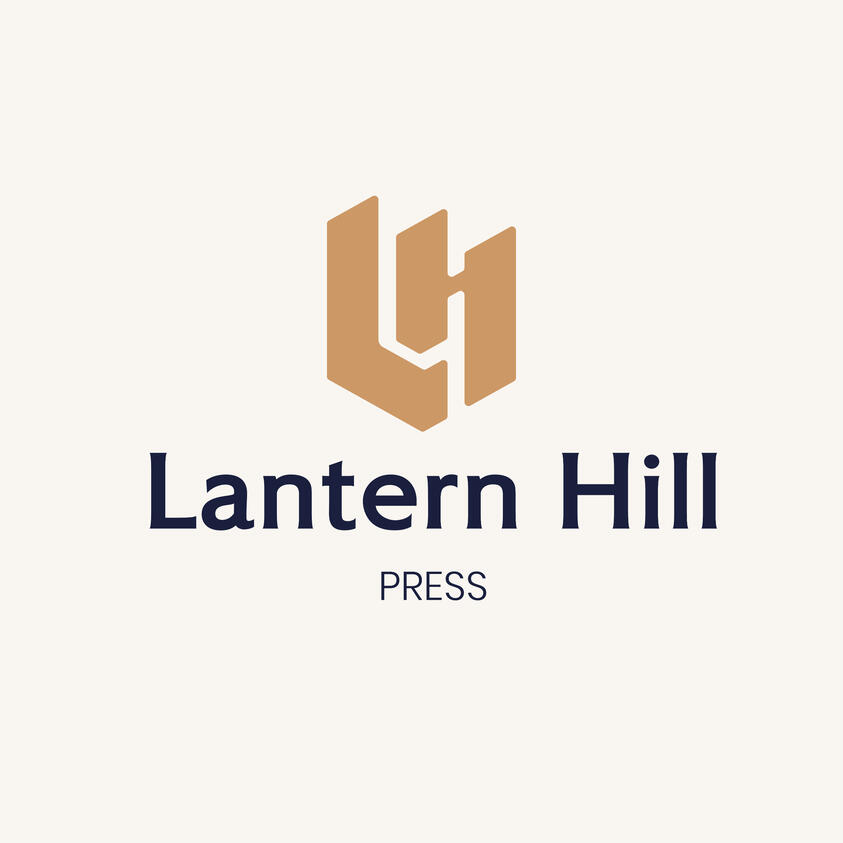
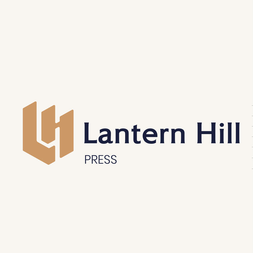
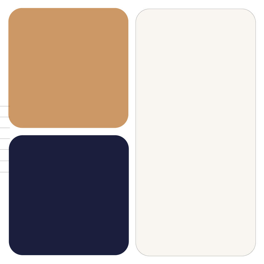
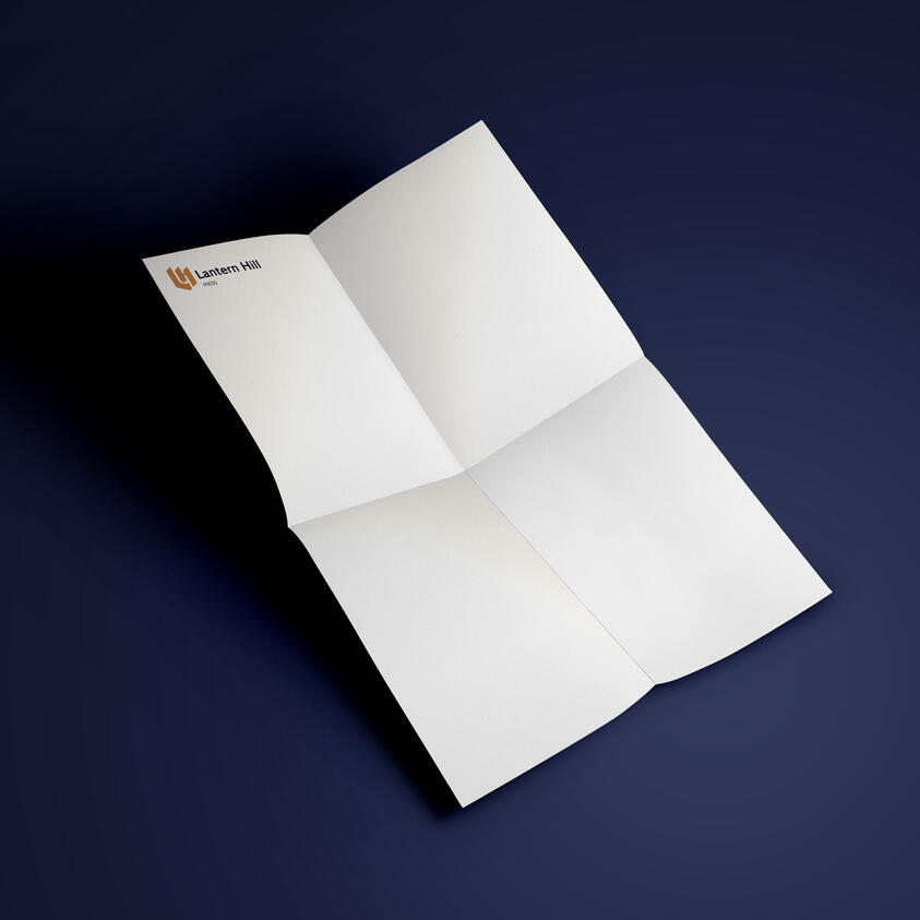
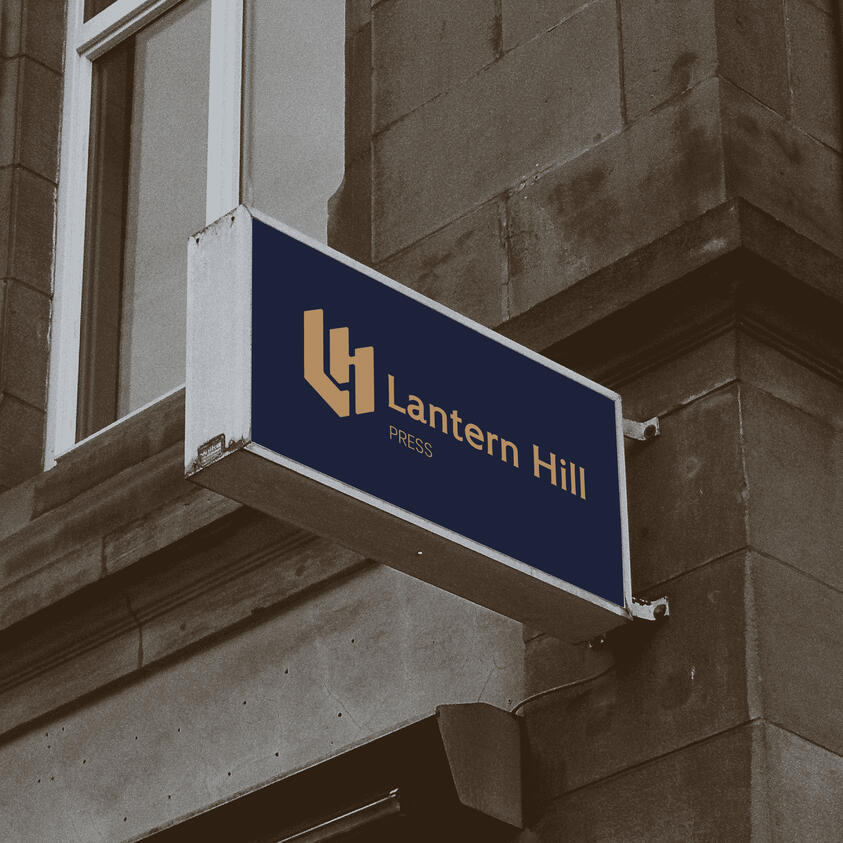
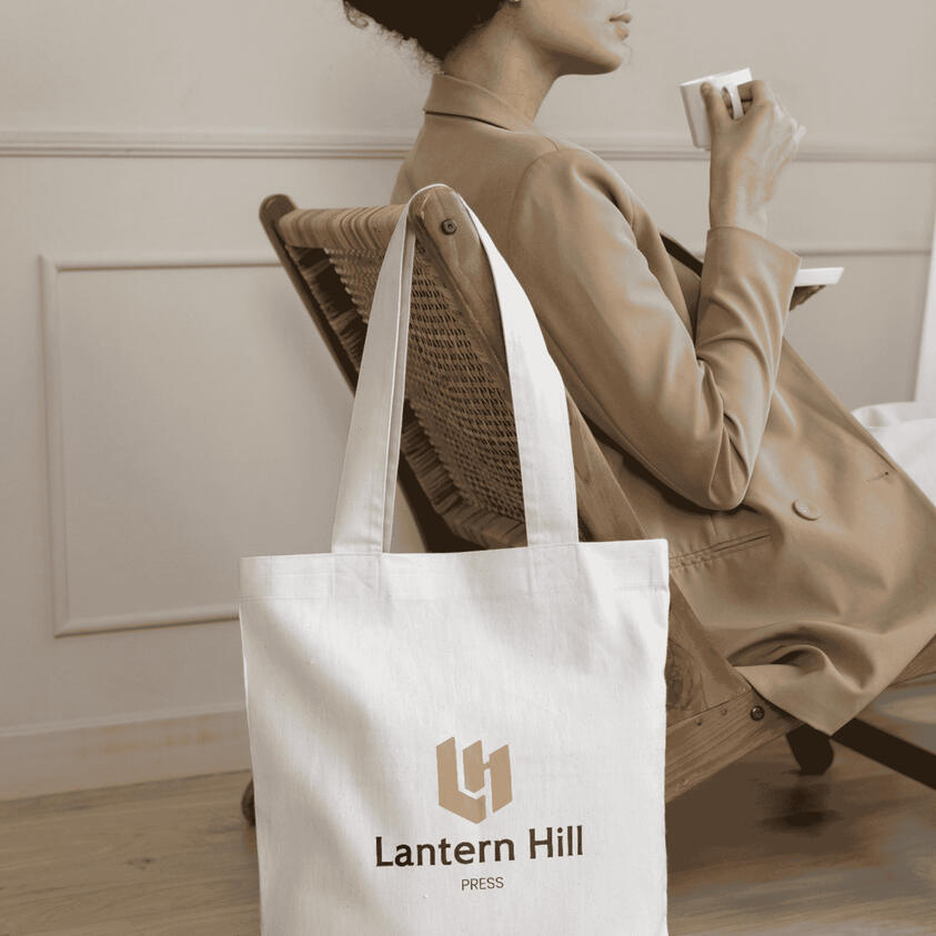
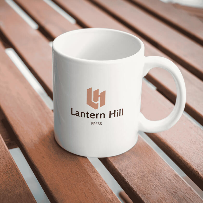
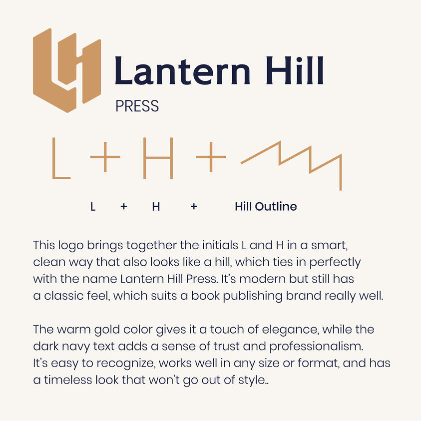
Lantern Hill Press
Lantern Hill Press is a fictional book publishing brand created for a design challenge by Brief Club. The brief called for a full visual identity — including a logo and bookmark — that captured the feel of a warm, thoughtful, and timeless literary brand.The challenge was to design something that felt both classic and fresh, with a visual story behind it. I started by exploring the initials "L" and "H", and eventually shaped them into a subtle hill form — a quiet nod to the brand’s name and purpose: to elevate stories and ideas.From logo design to mockups, I focused on creating something elegant, readable, and full of meaning. The process helped me push creative boundaries while staying grounded in purpose.This project reminded me how powerful simplicity can be — and how good design isn’t just about how it looks, but how it feels and what it says.
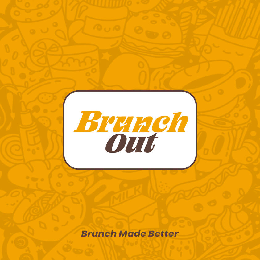
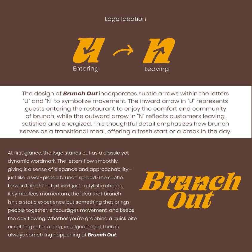
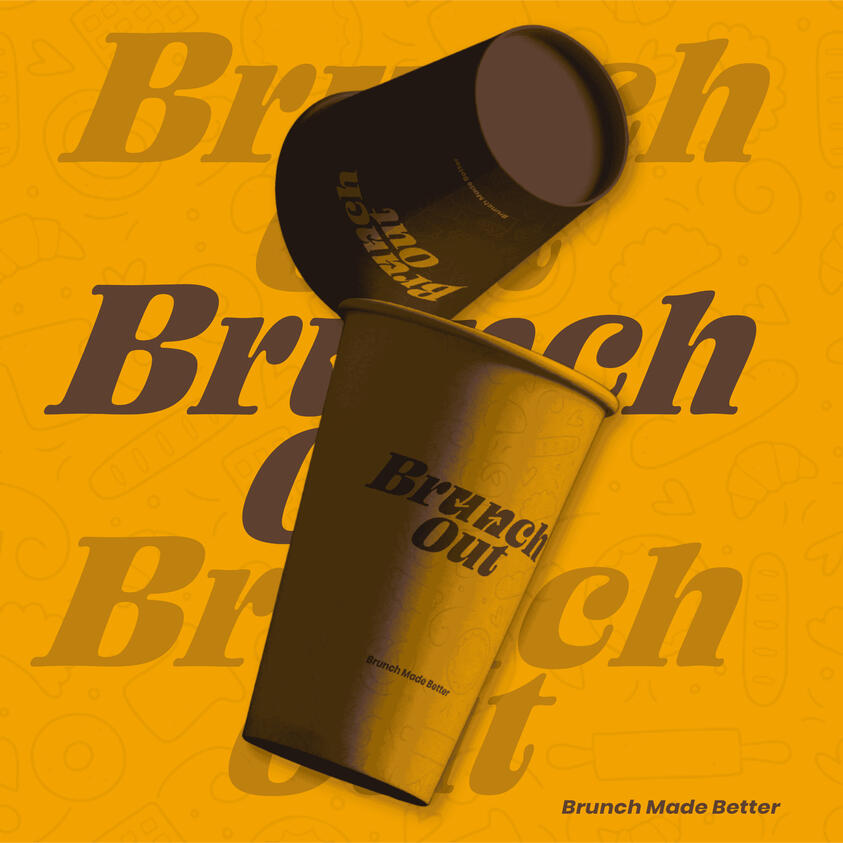
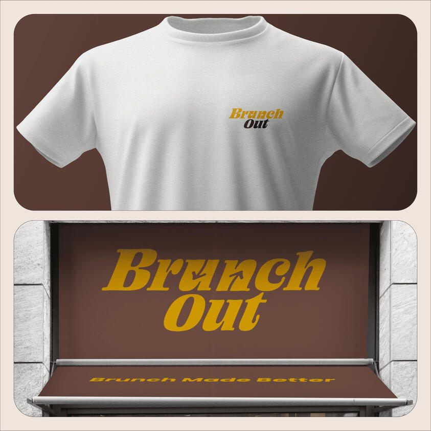
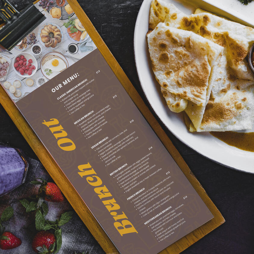
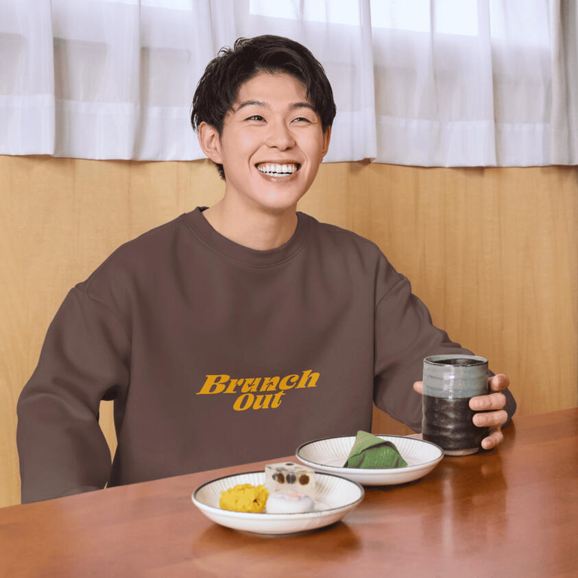
Brunch Out – Brand Identity Design
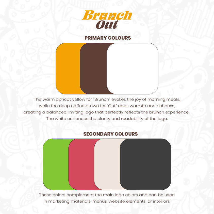
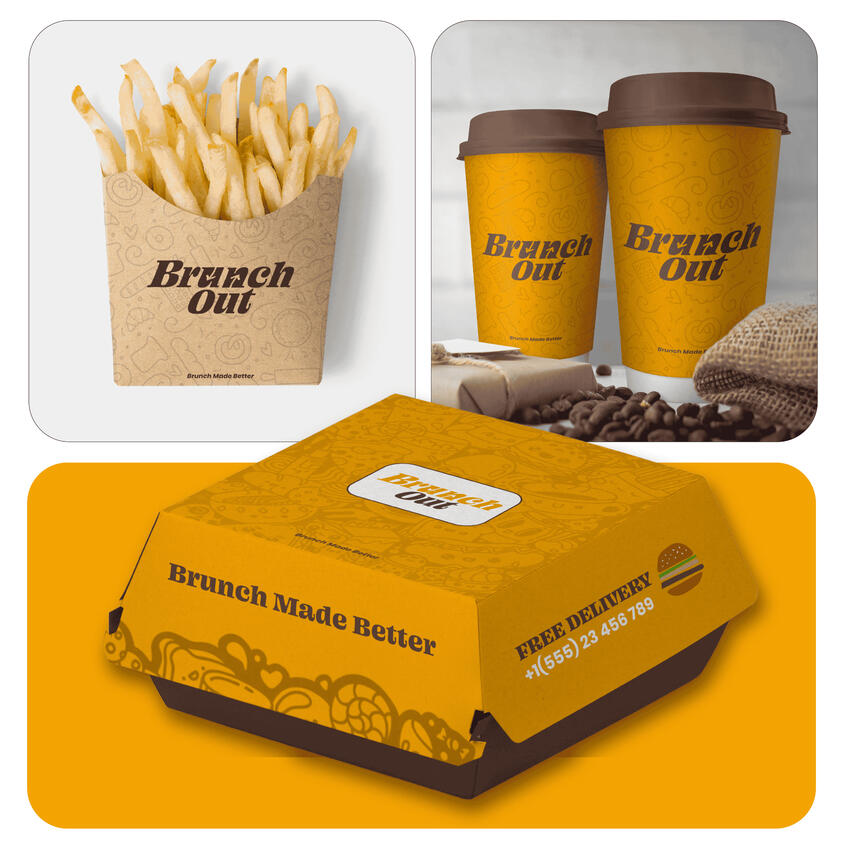
Brunch Out is a brunch-focused restaurant that wanted a brand identity as warm and inviting as their food. They needed a logo that would stand out, feel fresh, and capture the experience of coming in for a great meal and leaving satisfied.The challenge was creating something clean and modern, but with deeper meaning. I designed a custom wordmark with subtle arrows hidden in the letters “U” and “N” to represent movement in and out of the restaurant. I also gave the logo a slight tilt to add energy and flow—like the rhythm of a good brunch.I chose colors inspired by real food—golden waffles, fresh coffee—to make the brand feel cozy and delicious. The final design helped bring their vision to life and created a strong visual foundation they could proudly build on.
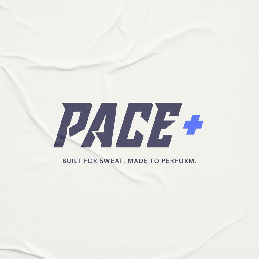
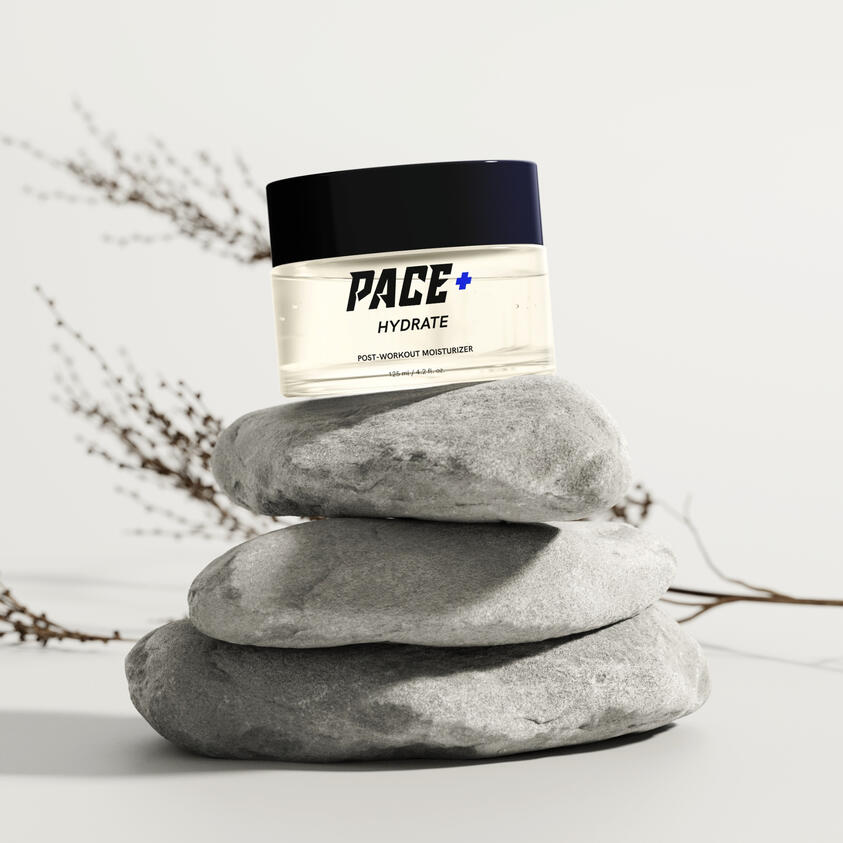
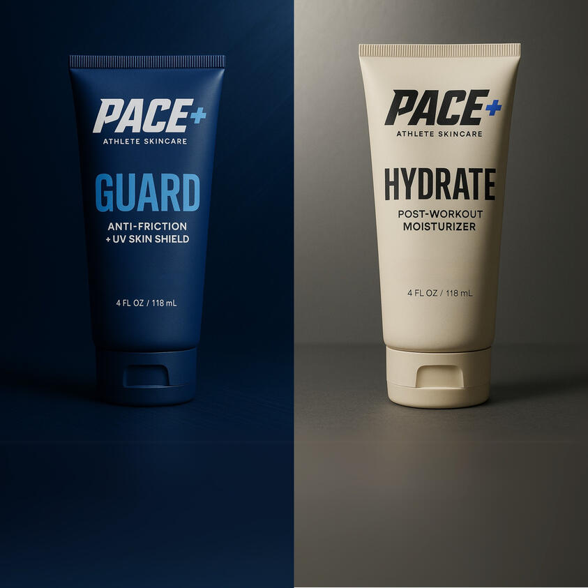
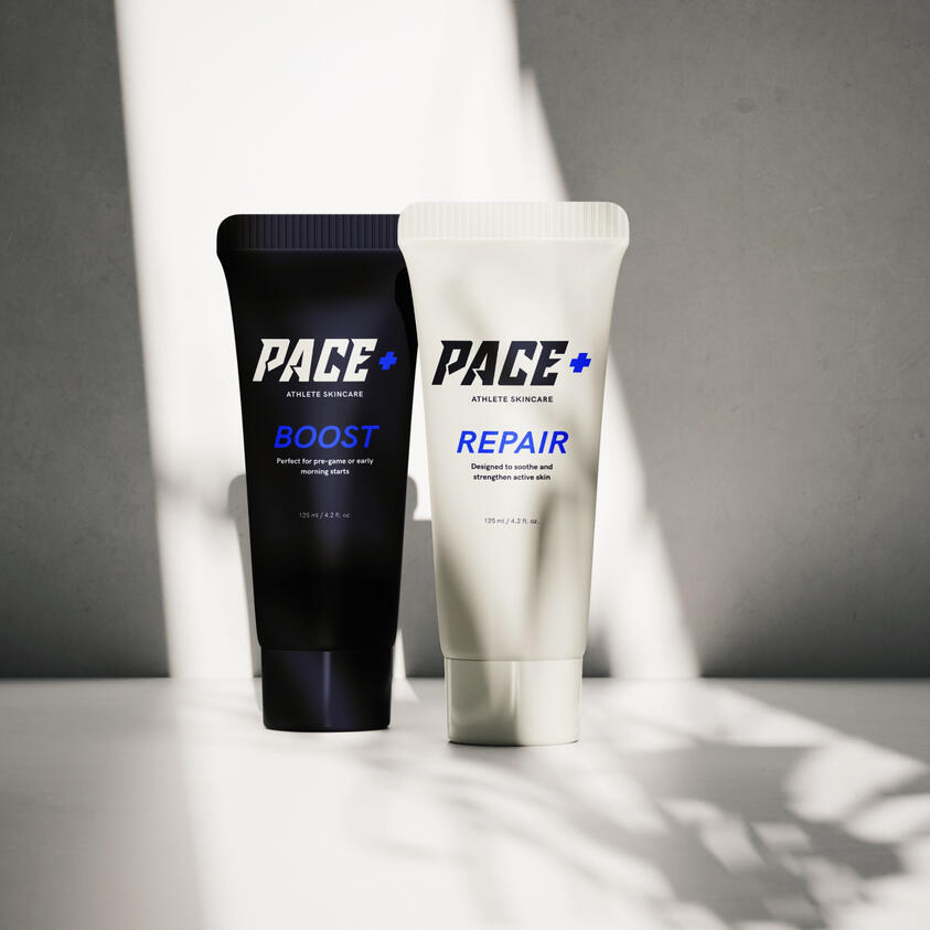
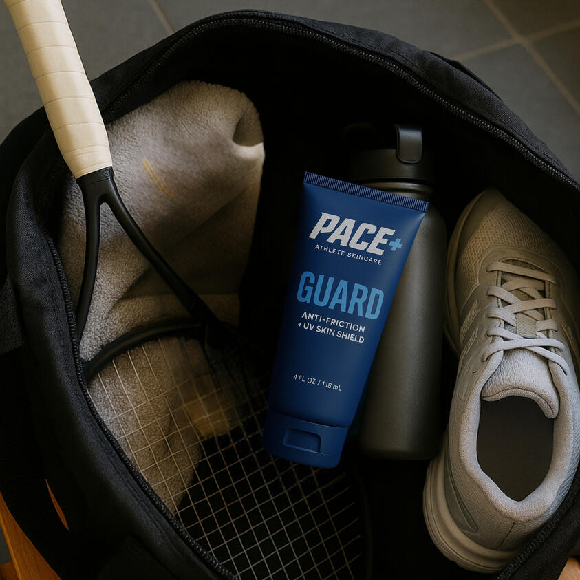
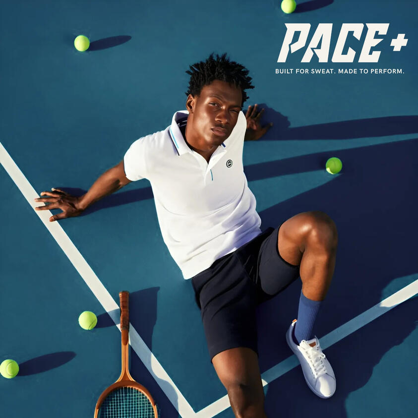
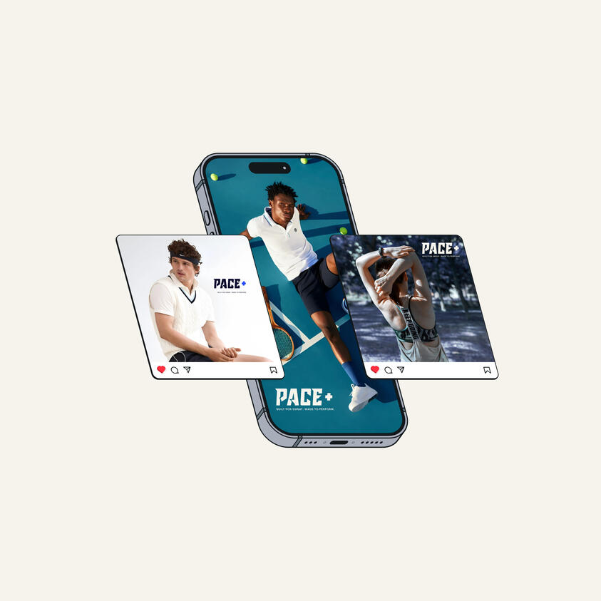
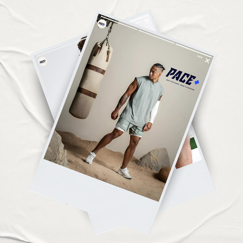
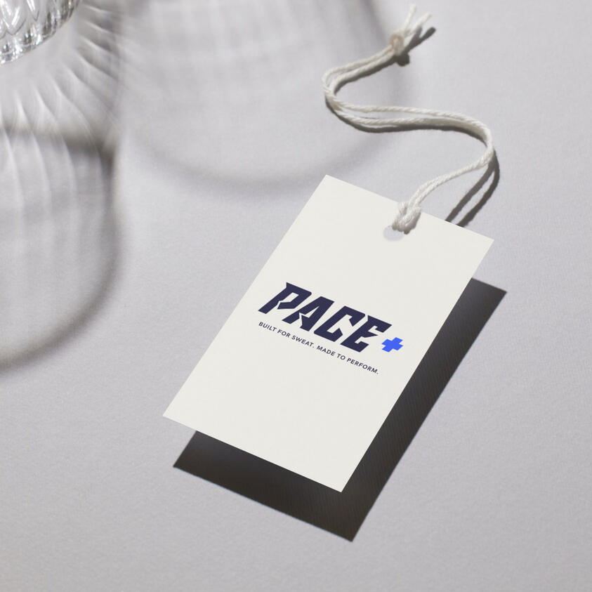
Pace+ Athlete Skincare — Branding & Packaging Design
When I began working on Pace+, the vision was clear: create a skincare brand made specifically for athletes — something clean, bold, and built for performance.The challenge? Most skincare brands either looked too clinical or too soft. Pace+ needed to feel strong yet approachable — a brand that could sit confidently in a gym bag or on a bathroom shelf.I crafted a brand identity that reflects motion, energy, and recovery. From the logo and color palette to the packaging mockups, every detail was designed to feel active, minimal, and athlete-approved.The result? A modern skincare brand that moves with you. One that tells athletes: “Your skin deserves recovery too.”
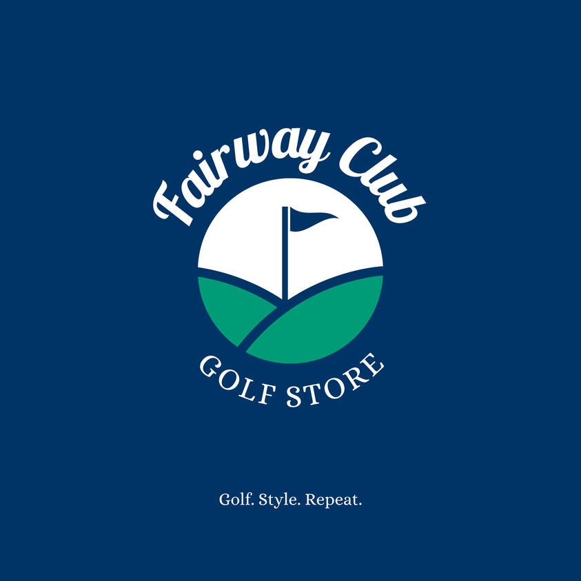
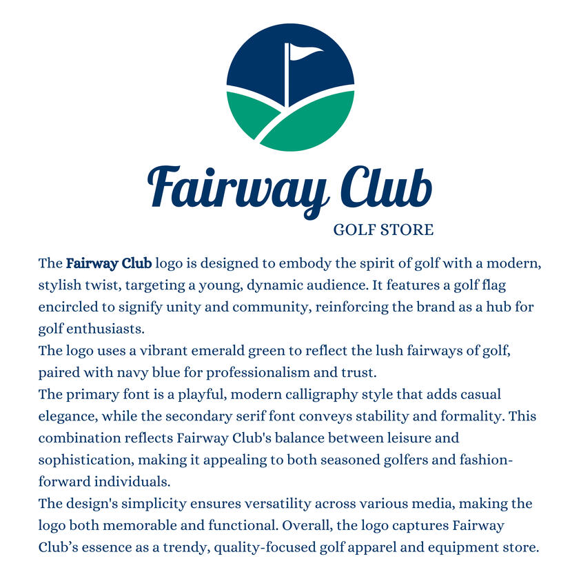
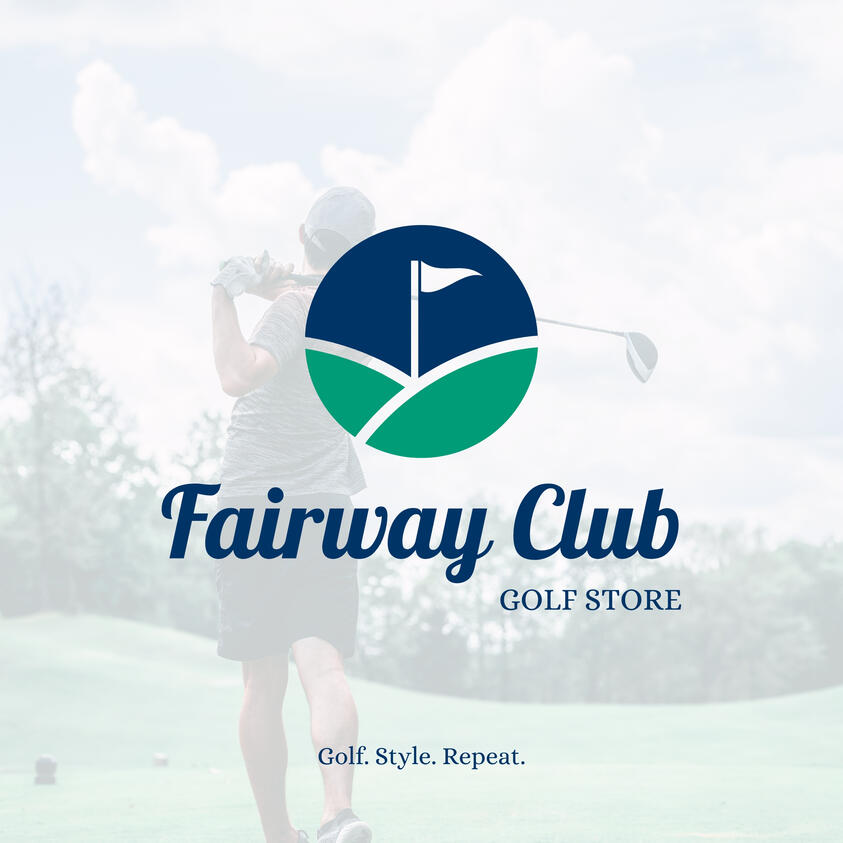
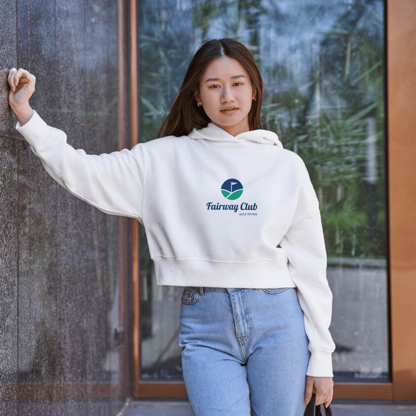
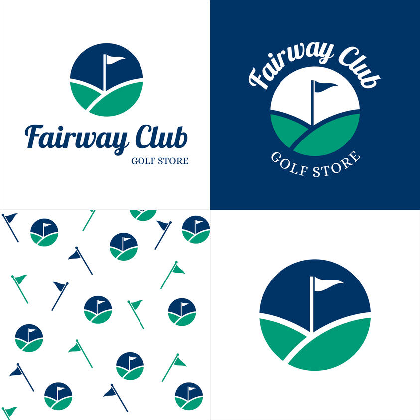
Fairway Club Golf Store
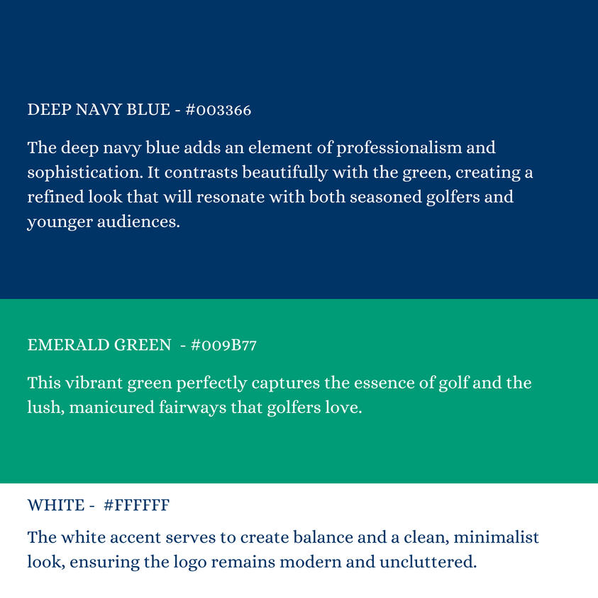
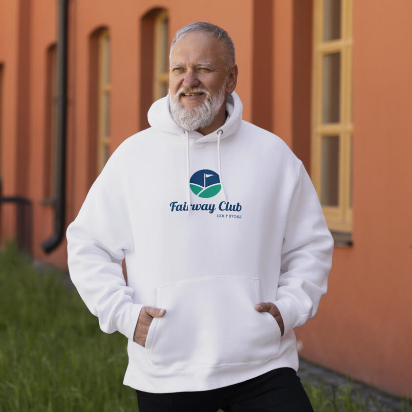
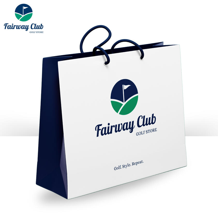
Fairway Club is a pop-up golf fashion store located right on the course, created to connect with a younger generation of golfers who love style just as much as the sport. The brand wanted a fresh, modern identity that felt sporty but still fashion-forward—something that could speak to both performance and lifestyle.The challenge was creating a logo that felt premium and athletic without being too traditional. I focused on blending elegant calligraphy with clean golf-inspired visuals to reflect both the energy of the sport and the casual sophistication of the target audience. A bold, modern color palette rooted in emerald green and navy brought the brand to life.The final design gave Fairway Club a distinct, recognizable look that could confidently sit on apparel, signage, and gear—making it more than just a store, but a stylish community for golfers.
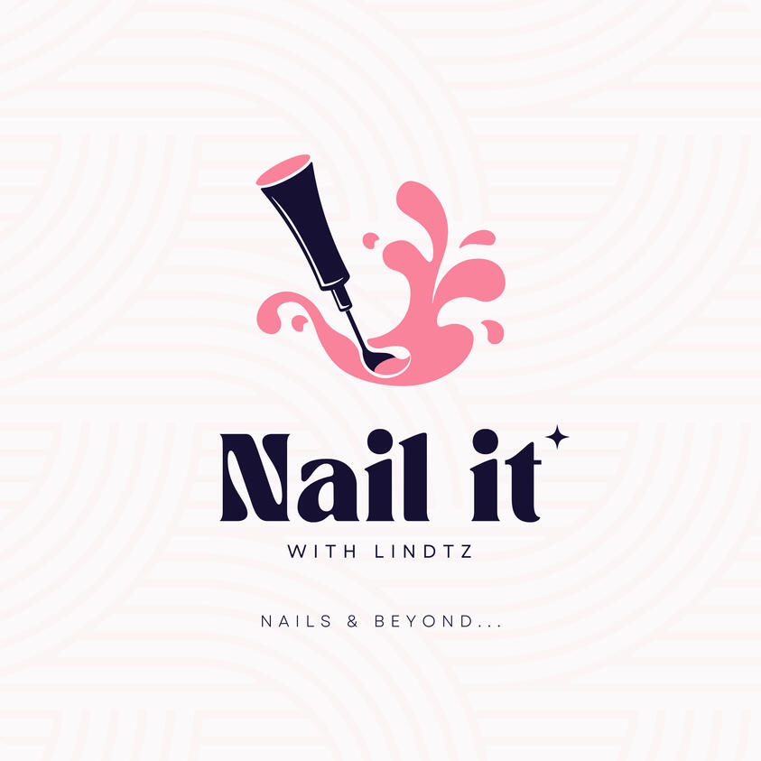
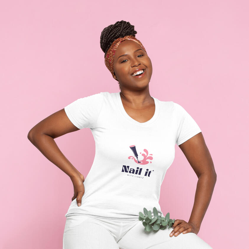
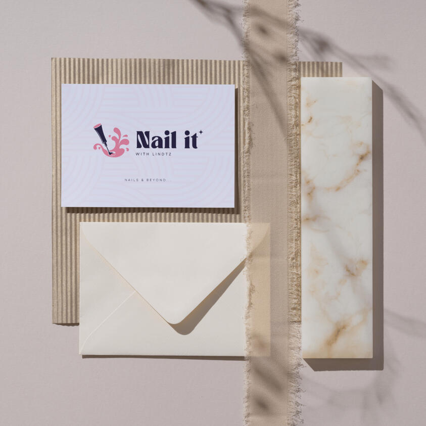
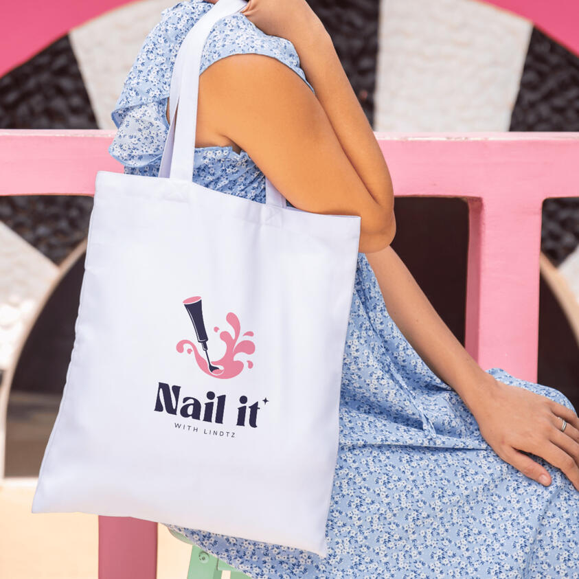
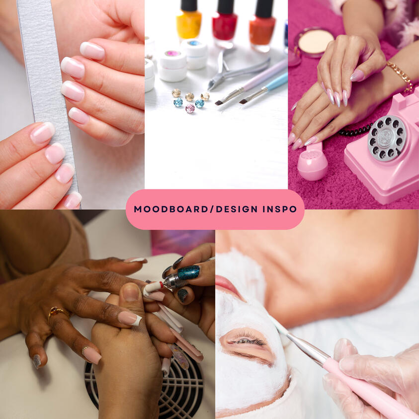
Nail It with Lindtz
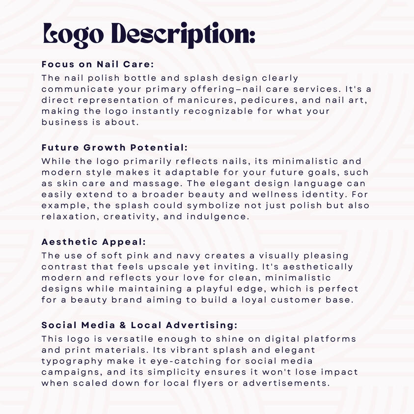
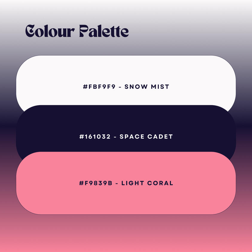
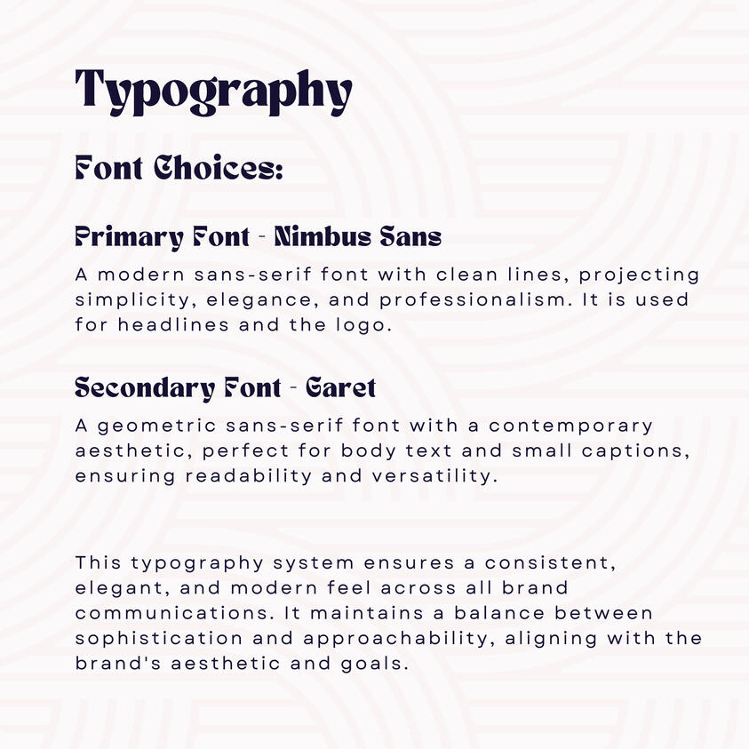
Nail It with Lindtz is a beauty brand that offers nail care, pedicures, manicures, and aims to grow into skincare and spa services. The founder wanted a brand identity that felt clean, elegant, and modern — something that would appeal to beauty lovers but still feel grounded and relatable.The challenge was finding the balance between classy and approachable. The brand needed to look professional enough for long-term growth, but still feel personal and inviting — like something you'd trust for your next self-care session.I designed a minimalist yet stylish logo using modern serif and sans-serif fonts (Nimbus and Garet), and paired them with a soft, warm color palette to reflect beauty, calm, and confidence. The visual identity was supported by social media mockups and packaging previews to show how the brand could live and breathe across touchpoints.The final brand gave Lindtz the confidence to market her business, and helped her audience immediately connect with what the brand stood for — self-care, simplicity, and style.